
Transform Your Sleep Sanctuary
When you are tossing and turning all night and waking up feeling worse for wear in the morning, your bedroom may be to blame! Your color palette can make or break your bedroom’s mood and atmosphere, so if you want your boudoir to be a peaceful escape from the stresses of everyday life and help you drift off into a good night’s rest; you really need to know how to choose the right color scheme.
The Importance of Bedroom Colors
Your bedroom ought to be more than just somewhere to sleep. It should be a space of retreat, the place where you go to wind down and recharge at the end of a long, stressful day.
Besides other factors such as bedding, furniture and lighting, the colors surrounding you play a big role in how you feel in this space and how you get the rest and rejuvenation you need. Blues and neutrals are well-suited for creating a restful atmosphere in your bedroom. They can yield calming effects for your body and mind, and encourage a restful night’s sleep. But with so many different colors to work with, how can you pick the ones that will give you the soul-soothing bedroom of your dreams?
Restless Nights and Unsettled Sleep
Resisting the Sandman’s embrace, do you lay in bed at night restlessly turning and tossing, struggling to turn off the noisy reel of your mind and drift into sleep? Or do you wake up in the morning feeling disoriented, dull, and dried-out, wondering how exactly you managed to sleep for eight hours straight? Unfortunately, your bedroom might be to blame.
The colors you surround yourself with could be contributing to your inability to rest and unwind. In extreme cases, this can affect your overall health. Intense bright colors can overstimulate your senses and make it hard to relax, but dull, uninspiring colors can also create a space that lacks ambience and promotes the sluggish attitude that we associate with Grumpy Cat. To create an ambient bedroom that would make anyone fall asleep, what is the best color palette to go for?
1: Embrace Calming Colors
The bedroom should be painted using colors that make people feel serene and relaxed.
Soft Blues and Greens
Unsurprisingly, soulless greys are out, while soft, muted blues and greens are recommended: ‘The colors should remind you of the outdoors, in particular the sky and nature,’ affirms Katz.
‘But won’t blue make my room feel cold and unwelcoming?’
Of course, some blue is so cold it can be unwelcoming, but you can choose a warmer, softer shade such as powder blue or sage green and make a welcoming space.
Soothing Neutrals
Soft whites, creams and warm grays are one-color palettes that are also good choices, as they offer a calm option and provide a flexible canvas for layering other colors and textures.
2: Consider Your Personal Preferences
Although some colors are universally considered to be relaxing and soothing, what you really need to think about is what colors you personally prefer and what they make you feel.
Reflect on Your Favorite Places
Think of places where you feel the most relaxed, the most comfortable. Some might think of a quiet beach, a wooded forest, a cabin in the mountains, and let those places guide you to colors you might use in a bedroom.
“How do I use my favorite colors in my bedroom palette?”
Layer colors and textures for a harmonious look.
Experiment with Sample Swatches
Experiment with sample swatches to see how colors look and feel in your space (hold up a swatch to different areas of the walls and also see how the colors change with the light throughout the day).
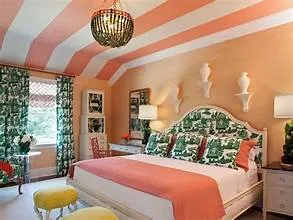
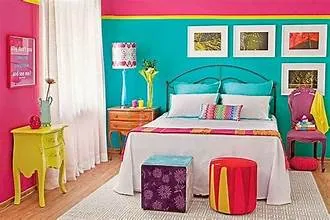
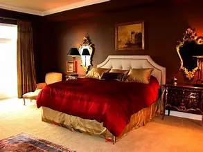
3: Create Harmony with Contrasting Tones
It’s important to select colors that induce relaxation and serenity, but contrast can add depth and visual interest to your bedroom palette.
Balance Cool and Warm Tones
Another way to make colors work nicely together is by mixing cool and warm tones. A cool blue or green combined with a warm neutral such as beige or taupe can help to give the bedroom palette a harmonious feel.
“But won’t contrasting colors make my room look busy?”
Not necessarily! If done thoughtfully, contrasting tones can add visual interest without making a space feel chaotic.
4: Layer Colors and Textures
Now that you have your color foundation, you can deepen the image with overlaid layers of color and textures.
Incorporate Textiles and Fabrics
Pile on plush rugs, a throw blanket and curtains in silky materials in order to make your bedroom den more tactile.
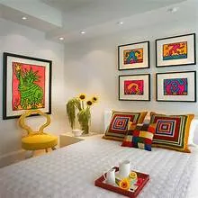
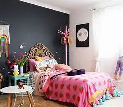
Mix and Match Patterns
Don’t be afraid to mix and match. If you’re bored by your bedroom décor, try out a different pattern or texture but keep the same color. If you’re feeling more adventurous, mix and match a few different patterns. You can pair stripes with florals, or a small check with a large-scale floral, or use the patterns in different colors.

Sweet Dreams Await
But you know what? Choose the right color palette for your bedroom and you’ll be able to turn that space into a well-functioning retreat, a place where you can retreat from the world to unwind after a tough day and sleep soundly through the night.
Whether you opt for soft and nurturing blues and greens, muted and neutral shades, or dramatic and contrasting combinations, there’s an assortment of color and texture palettes that will help you create a calming bedroom environment. Go on, embrace serene colors and textures, layer and layer until you’re happy, and you’ll emerge with a bedroom to die for — a haven of tranquil bliss; a lair for sweet dreams.